While Paul Graham and many others have pointed out the virtues of web compared to normal desktop software. For Nemo Documents, working as a file manager for local files, it was quite clear that we needed a desktop application. Given this how could we then apply as much of the good things about the web into developing a Windows application?
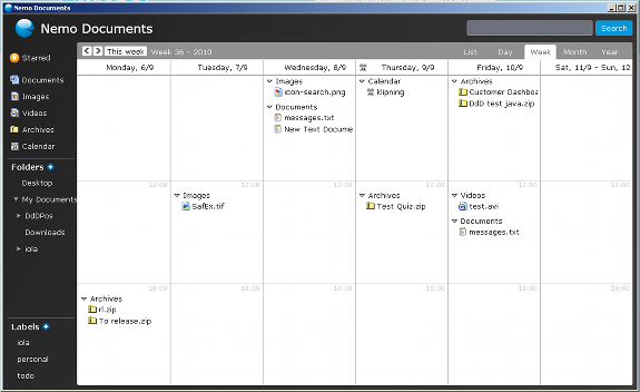
We quickly decided on WPF as it allows one much greater freedom in designing the application. We wanted something visually appealing and in this I think we succeeded (whether that is the case, is of course not up to me to decide :-)). But at least it is not the ordinary ugly grey programs that are so common in the Windows world. As for WPF as a framework I’m quite torn. On one side, it allows one to do a lot of fancy stuff, but on the other side there is way too-much architecture astronauting in the framework and that really hurts when you’re just trying to get something done. jQuery is a good example of how to do this right.
Another thing to learn from the web is to watch the error log and quickly fix problems people are seeing. There is nothing more frustrating as a user than software that is not working, so we made it virtue to respond quickly to errors and to get new versions into the hands of people. With the build-in auto-update feature of Visual Studio, it’s quite easy to keep already installed versions updated. It’s not quite as smooth as updated code on a server, but it goes a long way. And I really think that providing excellent customer support is key these days. When it’s so easy to go “next-door” one has to provide exceptional service to retain users.
The last point also goes hand-in-hand with agile. Getting software out and into the hands of people to get early feedback and use that to better shape the software to fit real needs. We try to release new features when we consider them stable enough for ourselves to use. And that doesn’t have to be every half year 🙂 We recently did this with the google calendar and google docs integration. A feature we coded and rolled out a month after the initial release.


